Since our creation, innovation has been at the heart of our commitment. With the ClickOnSite release 2.3.3, we are taking a significant step forward by introducing a brand-new User Interface (UI).
Until now, our focus has primarily been on technological advancements, prioritizing the functionality and performance of our product. However, we have recognized the crucial importance of aesthetics in the visual user experience. To better meet this requirement, we have chosen to align a modernized aesthetic with our technological innovations, thus adhering to industry best practices.
This redesign goes far beyond a simple facelift. It signifies a graphic transformation aimed at enhancing your ClickOnSite experience and providing you with a more innovative tool than ever before. Stay tuned for the latest updates and exciting discoveries that await you.
Our revitalized UI goes beyond a mere facelift; it's a complete brand reimagination. Drawing inspiration from main renowned management software, we've curated an aesthetic that breathes innovation. Vibrant color palettes, impactful contrasts, and dynamic hover effects redefine the visual journey. Meticulously sculpted rounded edges introduce a touch of sophistication to each element. Every tweak, from the fresh hues to the enthralling hover effects, underscores our unwavering commitment to perpetual innovation.
This overhaul wasn't a hasty decision. It stems from an exhaustive analysis of market trends and a fruitful partnership with Elise Romefort, a renowned expert in UI design, particularly in management software. This revamped UI is the culmination of a process that commenced in early 2023, with updates being implemented in stages, ensuring a seamless transition. As of now, 60% of the new UI is already accessible, poised to revolutionize your experience.
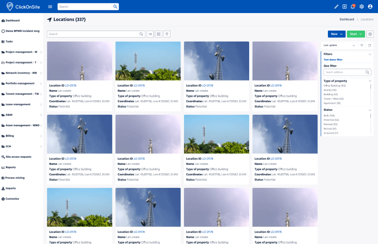
Among the numerous enhancements, the redesign of the photo gallery and long lists stand out. Their modern and sleek design highlights the photos and/or essential information, providing an immersive experience that will delight our users.
Example of the new location list design
Thanks to a meticulously designed interface, this new UI enhances your reading speed. Crucial information is emphasized, enabling you to make well-informed decisions faster than ever before.
Example of the new long list design
Explore the bold and dynamic color palette of our new UI. With sharp contrasts and interactive hover effects, your visual experience is bound to be captivating. Discover how our updated interface transforms your interaction.
Example of new entity detail design
"This new UI of ClickOnSite is not merely an aesthetic change; it integrates seamlessly into IT-Development's overarching vision. We aspire to enhance the daily work of telecom professionals by streamlining their tasks and boosting their efficiency. This modern design aligns with an ongoing commitment to innovation, providing our users with cutting-edge technological solutions. It's not just an update; it's a promise of excellence. An invitation to explore a reimagined experience for optimal performance.
And we don't stop there! The final touches are being put on the last screens. We're eagerly anticipating your feedback, as your experience is central to our continuous improvement efforts. So, Get in touch, and stay tuned for the latest updates and exciting discoveries!"